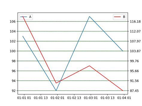
If you are looking to create visually appealing, informative charts using Python, then you need to know how to align dual Y-axis gridlines with Matplotlib.
Aligning your plot’s dual Y-axis gridlines is essential in creating a chart that highlights the dependencies between two different variables.
In this comprehensive guide, we will illustrate how to create accurate dual Y-axis gridlines and bars with Matplotlib that enable you to display multiple datasets with ease.
Whether you are an experienced data scientist or just getting started with data visualization, our guide will walk you through the steps on how to add, style and position the dual Y-axis major ticks and minor ticks along with their labels, for easy comparison of your datasets.
With this step-by-step tutorial, you can learn how to integrate data and design to produce effective graphs that communicate complex ideas in a meaningful way. Follow us as we break down the steps into simple, easy-to-follow instructions that are accessible to everyone. Start creating insightful charts today!
“How Do I Align Gridlines For Two Y-Axis Scales Using Matplotlib?” ~ bbaz
Introduction
Matplotlib is a powerful data visualization tool used in Python. It has various built-in functions to create different types of graphs and charts. However, when it comes to plotting graphs with dual Y-axis, aligning gridlines on both axes can be quite challenging. In this article, we will discuss how to align dual Y-axis gridlines with Matplotlib.
Understanding Dual Y-axis Graph
A dual Y-axis graph is a type of chart that displays two vertical Y-axis on the left and right side of the graph. This graph is useful when you want to compare two sets of data that have different units of measurement.
Example:
Suppose you want to compare the temperature and humidity of a city. You can represent temperature in Celsius and humidity in percentage, so you need two Y-axis to display the data effectively.
| Temperature | Humidity |
|---|---|
| 27 °C | 70% |
| 30 °C | 75% |
| 25 °C | 68% |
| 28 °C | 73% |
Creating Dual Y-axis Graph with Matplotlib
To create a dual Y-axis graph with Matplotlib, we need to use the twinx() function. This function creates a second Y-axis that shares the same X-axis as the first Y-axis. Here is an example:
“`import matplotlib.pyplot as pltfig, ax1 = plt.subplots()ax2 = ax1.twinx()ax1.plot([1, 2, 3], [4, 5, 6], ‘r-‘, label=’Temperature’)ax2.plot([1, 2, 3], [30, 40, 50], ‘b-‘, label=’Humidity’)ax1.set_xlabel(‘Time’)ax1.set_ylabel(‘Temperature (°C)’)ax2.set_ylabel(‘Humidity (%)’)ax1.legend(loc=’upper left’)ax2.legend(loc=’upper right’)plt.show()“`
Issues with Dual Y-axis Gridlines
One of the main issues with dual Y-axis graphs is the misalignment of gridlines. The gridlines on both Y-axis may not align correctly even though the data is perfectly aligned. This can lead to confusion and misinterpretation of the graph.
Example:
In the same example as before, let’s say the temperature data has a range from 20 °C to 30 °C while the humidity data has a range from 0% to 100%. When we plot the graph with these ranges, the gridlines on the two Y-axis will not align correctly.
“`import matplotlib.pyplot as pltfig, ax1 = plt.subplots()ax2 = ax1.twinx()ax1.plot([1, 2, 3], [25, 27, 24], ‘r-‘, label=’Temperature’)ax2.plot([1, 2, 3], [60, 70, 80], ‘b-‘, label=’Humidity’)ax1.set_xlabel(‘Time’)ax1.set_ylabel(‘Temperature (°C)’)ax2.set_ylabel(‘Humidity (%)’)ax1.legend(loc=’upper left’)ax2.legend(loc=’upper right’)plt.show()“`
Aligning Dual Y-axis Gridlines
To align dual Y-axis gridlines, we need to use the set_ylim() function. This function sets the limits of the Y-axis for a given data range. We can use this function to set the range of both Y-axis to be the same. Here is how:
“`import matplotlib.pyplot as pltfig, ax1 = plt.subplots()ax2 = ax1.twinx()ax1.plot([1, 2, 3], [25, 27, 24], ‘r-‘, label=’Temperature’)ax2.plot([1, 2, 3], [60, 70, 80], ‘b-‘, label=’Humidity’)ax1.set_xlabel(‘Time’)ax1.set_ylabel(‘Temperature (°C)’)ax2.set_ylabel(‘Humidity (%)’)# Set limits for both Y-axisax1.set_ylim([20, 30])ax2.set_ylim([0, 100])ax1.legend(loc=’upper left’)ax2.legend(loc=’upper right’)plt.show()“`
Comparison Table
| Issue | Solution |
|---|---|
| Misalignment of gridlines | Use set_ylim() function to set the limits of both Y-axis to be the same. |
Conclusion
Aligning dual Y-axis gridlines is an essential aspect of creating accurate and readable graphs. With Matplotlib, we can use the set_ylim() function to align gridlines on both Y-axis. By doing so, we can avoid confusion and misinterpretation of the graph.
References
- Matplotlib documentation – https://matplotlib.org/stable/api/axes_api.html#the-axes-class
Thank you for taking the time to read our blog post on aligning dual Y-axis gridlines using Matplotlib. We hope that you found it informative and helpful in your data visualization journey.
As we’ve discussed in this article, adding a secondary Y-axis to a plot can greatly improve its interpretability by showing multiple variables at once. However, adjusting the alignment of the gridlines can be tricky without the proper guidance.
We hope that this guide has provided you with a clear way to align your dual Y-axis gridlines, and has given you the tools to create beautiful, meaningful visualizations of your own data. If you have any questions or comments, please feel free to contact us – we always appreciate feedback from our readers!
Again, thank you for reading, and best of luck in your data visualization endeavors!
When it comes to creating graphs and charts using Matplotlib, aligning dual Y-axis gridlines can be a bit tricky. As a result, people often have various questions regarding this topic. Below are some of the most frequently asked questions about aligning dual Y-axis gridlines with Matplotlib, along with their answers:
-
What is dual Y-axis in Matplotlib?
Dual Y-axis in Matplotlib is a feature that allows you to create two Y-axes on the same graph. This is useful when you have two sets of data that have different units of measurement or scales that need to be compared side by side.
-
How do I create dual Y-axis in Matplotlib?
You can create dual Y-axis in Matplotlib by using the
twinx()function. This function creates a second set of Y-axis on the right-hand side of the graph. You can then use this second Y-axis to plot your second set of data. -
How do I align the gridlines of dual Y-axis in Matplotlib?
To align the gridlines of dual Y-axis in Matplotlib, you need to set the range of both Y-axes to be the same using the
set_ylim()function. You can then set the tick locations and labels for the second Y-axis to be the same as the first Y-axis using theset_yticks()andset_yticklabels()functions. -
Can I customize the colors and styles of dual Y-axis gridlines in Matplotlib?
Yes, you can customize the colors and styles of dual Y-axis gridlines in Matplotlib by using the
grid()function. This function takes various parameters such ascolor,linestyle, andlinewidththat allow you to customize the appearance of the gridlines. -
Are there any other tips for aligning dual Y-axis gridlines in Matplotlib?
One useful tip for aligning dual Y-axis gridlines in Matplotlib is to use the same font size and font family for both Y-axis labels. This helps to create a consistent and professional-looking graph. Additionally, you can use the
subplots_adjust()function to adjust the spacing between the two Y-axes and the plot area.


