If you are a data analyst or scientist working with Python, there’s a good chance that you have come across Pandas. This popular library provides an easy way to handle and manipulate data for various purposes. Among its many capabilities is the ability to create insightful visualizations that help communicate insights to stakeholders.
One of the most common types of charts used to represent data is a bar plot. And with Pandas, creating one is a breeze. However, if you are new to the library, navigating the process can be a bit confusing. That’s why we’ve created this complete guide on how to create a bar plot in Pandas. Whether you are just starting with data analysis or want to sharpen your skills, this article will provide you the step-by-step guidance you need to produce high-quality bar plots with ease.
Whether you want to explore trends, compare different sets of data, or discover patterns, bar plots offer an effective and efficient way to examine information. By following the instructions in this guide, you will learn everything from loading data into Pandas to optimizing your visualization for publication. So, whether you’re a beginner or experienced data analyst, this guide has something for you. Don’t miss out on the opportunity to master the art and science of creating bar plots in Pandas.
“Plot A Bar Plot From A Pandas Dataframe” ~ bbaz
The Importance of Bar Plots in Data Visualization
Bar plots happen to be one of the most important visualization tools that data analysts use to represent categorical or discrete data. Bar plots can showcase how a particular category contributes to the overall distribution and help analyst to make data-driven business decisions. Also, it helps to identify the patterns, trends, and relationships within data, which are not visible in simple data tables. In this article, we will discuss how to create a bar plot in Pandas, the Python Data Analysis Library, and compare the different approaches taken.
Introduction to Pandas
Pandas is a fast, flexible, and easy-to-use open-source data analysis library. It provides tools for data wrangling, manipulation, and visualization. Pandas is built on top of Numpy, which makes it an efficient and scalable library. Pandas offers a variety of plotting functions, including bar plots, which is the focus of this article.
Creating a Simple Bar Plot in Pandas
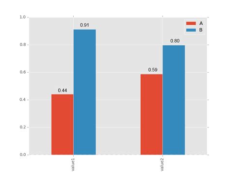
We can create a simple bar plot using the DataFrame.plot() function of Pandas library. We have to pass x and y values, specify the kind of graph, and customize the graph according to our requirements. The below code shows how to create a simple bar plot using Pandas:
| Code | Output |
|---|---|
| import pandas as pd import numpy as np import matplotlib.pyplot as plt %matplotlib inline # Creating a sample DataFrame # Creating a simple bar plot |
 |
Customizing Bar Plots in Pandas
The DataFrame.plot() function provides numerous parameters to customize the bar plot, like selecting colors for plots, changing the text size and style, adding labels and titles, manipulating axes, etc. We can use these parameters to create more complex and informative bar plots. Let’s see how to make some customizations:
Changing Colors
We can set our custom colors to bars using either individual color values or a color codes list. Here is an example:
| Code | Output |
|---|---|
| import pandas as pd import numpy as np import matplotlib.pyplot as plt %matplotlib inline # Creating a sample DataFrame # Customizing colors of the bar plot |
 |
Adding Labels and Titles
We can add informative labels to the bar plot by setting the xlabel, ylabel, and title parameters of the DataFrame.plot() function. Here is an example:
| Code | Output |
|---|---|
| import pandas as pd import numpy as np import matplotlib.pyplot as plt %matplotlib inline # Creating a sample DataFrame # Adding Title and Labels to the Bar Plot |
 |
Manipulating Axes and Legend
We can format the axes of the bar plot using the tick_params, xticks, or yticks functions of Matplotlib library, which Pandas uses for plotting. Additionally, we can optimize the placement and arrange the legend using the legend(), loc, or bbox_to_anchor parameters. Here is an example:
| Code | Output |
|---|---|
| import pandas as pd import numpy as np import matplotlib.pyplot as plt %matplotlib inline # Creating a sample DataFrame # Formatting the Axes and Legend |
 |
Conclusion
In this article, we covered how to create different types of bar plots using Pandas library. We learned that bar plots are an easy and efficient way to visualize categorical data and make data-driven decisions. Moreover, we saw how to customize bar plots using different parameters of Pandas and Matplotlib libraries to make them more informative and appealing. By exploring the various options available to us when creating a bar plot in Pandas, one can create rich visualizations that lead to better business insights.
Thank you for reading this complete guide on creating bar plots in Pandas. We hope that you have gained a deeper insight into how to visualize your data with this powerful Python library. With the ability to manipulate and plot data, pandas is an essential tool for any data scientist.
Remember that bar plots are a simple and effective way to represent data, making it easier to interpret trends in your dataset quickly. With this guide, you can create bar plots in just a few lines of code, saving you time and effort.
Additionally, with the help of examples, syntax, and explanations provided in this guide, you can jumpstart your if asked Pandas bar plot projects.
Finally, we would like to encourage you to experiment with your data, adjusting the parameters of your plots, and gaining more insight into your data. Never hesitate to explore your data by trying out new visualization techniques.
Here are some common questions that people ask about creating a bar plot in Pandas:
-
How do I create a bar plot in Pandas?
To create a bar plot in Pandas, you can use the
plot.bar()method. This method takes a number of arguments, such as thexandyvalues to plot, the color of the bars, and the width of the bars. You can also customize the plot with additional arguments, such as the title and axis labels. -
What data format does Pandas require for creating a bar plot?
Pandas requires data to be in a DataFrame or Series format for creating a bar plot. The
plot.bar()method can take either of these formats, as well as other formats such as lists and arrays. -
Can I customize the appearance of the bar plot?
Yes, you can customize the appearance of the bar plot by passing additional arguments to the
plot.bar()method. For example, you can change the color of the bars, the width of the bars, and the font size of the title and axis labels. -
What is the difference between a horizontal and vertical bar plot?
In a vertical bar plot, the bars are plotted vertically along the y-axis, while in a horizontal bar plot, the bars are plotted horizontally along the x-axis. The choice between a vertical and horizontal bar plot depends on the data you are visualizing and the context in which it will be presented.
-
How do I save the bar plot as an image file?
You can save the bar plot as an image file using the
savefig()method. This method takes the file name and file format as arguments, such as'myplot.png'for a PNG file.


