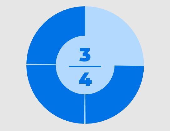
This time I will share jQuery Plugin and tutorial about Display Percentage/Progress Values As Gauges – Circle Progress, hope it will help you in programming stack.
Yet another circle progress bar plugin to display any numeric values in a responsive, customizable, animated percentage/progress graphs: circles, ring charts, pie charts, etc.
More features:
- Fully customizable via JavaScript and CSS.
- Vector shaped based on SVG.
- Rotate clockwise or anti-clockwise.
- Fancy fill animations with easing functions.
- 6 display modes for values.
- Also can be used as a Vanilla JavaScript plugin.
How to use it:
1. Load the Circle Progress plugin’s script in the document. To use the Circle Progress as a jQuery plugin, make sure to load the jquery.circle-progress.min.js after the latest jQuery JavaScript library.
2 |
<script src="dist/circle-progress.min.js"></script> |
6 |
<script src="dist/jquery.circle-progress.min.js"></script> |
2. Create an empty container to hold the percentage/progess circle.
1 |
<div class="progress"></div> |
3. Initialize the plugin and specify the current/max values as follows:
02 |
new CircleProgress('.progress', { |
08 |
$('.progress').circleProgress({ |
4. Customize the styles of the the percentage/progess circle with the following CSS classes.
01 |
.circle-progress-svg { |
09 |
.circle-progress-circle { |
17 |
.circle-progress-value { |
25 |
.circle-progress-text { |
32 |
.circle-progress-text-value { |
39 |
.circle-progress-text-max { |
5. Set the text representation of the values:
- horizontal (default)
- vertical
- percent
- value
- valueOnCircle
- none
1 |
new CircleProgress('.progress', { |
2 |
textFormat: 'horizontal' |
6. Customize the fill animation.
1 |
new CircleProgress('.progress', { |
4 |
animation: 'easeInOutCubic', |
7. Set the starting angle in degrees. Default: 0.
1 |
new CircleProgress('.progress', { |
8. More configuration options with default values.
01 |
new CircleProgress('.progress', { |
13 |
indeterminateText, '?' |
Changelog:
v0.2.0 (2020-08-23)
v0.1.2 (2020-05-02)
- Replace SVG innerHTML polyfill
v0.1.1 (2020-04-27)
- Extend animation capabilities
v0.1.0 (2019-10-05)
- Add CSS class to the SVG element
This awesome jQuery plugin is developed by tigrr. For more Advanced Usages, please check the demo page or visit the official website.


