This time I will share jQuery Plugin and tutorial about Create Dynamic Bootstrap 4 Modals In jQuery – bootstrap-show-modal.js, hope it will help you in programming stack.

| File Size: | 9.62 KB |
|---|---|
| Views Total: | 9198 |
| Last Update: | |
| Publish Date: | |
| Official Website: | Go to website |
| License: | MIT |
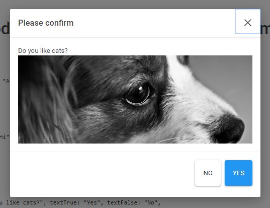
Yet another Bootstrap 4 modal wrapper plugin which lets you create beautiful, responsive, dynamic alert/confirm dialog boxes and complex modal windows using Bootstrap 4 modal component.
How to use it:
1. To use the plugin start with loading the latest jQuery library and Bootstrap 4 framework in the document.
1 |
<link rel="stylesheet" href="/path/to/cdn/bootstrap.min.css" /> |
2 |
<script src="/path/to/cdn/jquery.slim.min.js"></script> |
3 |
<script src="/path/to/cdn/bootstrap.min.js"></script> |
2. Load the JavaScript bootstrap-show-modal.js after jQuery library and we’re ready to go.
1 |
<script src="src/bootstrap-show-modal.js"></script> |
3. The JavaScript to create an alert popup with an OK button.
1 |
$.<a href="https://www.jqueryscript.net/tags.php?/Modal/">Modal</a>.alert({ |
2 |
title: "Alert Popup", |
3 |
body: "This is an alert popup" |
4 |
}) |
4. The JavaScript to create a basic modal window.
1 |
$.Modal.show({ |
2 |
title: "Modal Window", |
3 |
body: "This is a basic modal window" |
4 |
}) |
5. The JavaScript to create a confirmation dialog with confirm/cancel actions.
01 |
$.Modal.confirm({ |
02 |
title: "Confirm Dialog", |
03 |
body: "Are You Sure", |
04 |
textTrue: "Okey", |
05 |
textFalse: "Cancel", |
06 |
confirmed: function (result) { |
07 |
if (result) { |
08 |
// do something |
09 |
} else { |
10 |
// do something |
11 |
} |
12 |
}, |
13 |
hidden: function () { |
14 |
// do something |
15 |
} |
16 |
}) |
6. All default options.
01 |
{ |
02 |
03 |
// modal title |
04 |
title: "", |
05 |
06 |
// modal body |
07 |
body: "", |
08 |
09 |
// modal footer |
10 |
footer: "", |
11 |
12 |
// additional CSS class(es) |
13 |
modalClass: "fade", |
14 |
15 |
// additional CSS class(es) for ".modal-dialog" |
16 |
modalDialogClass: "", |
17 |
18 |
// Bootstrap 4 modal's options |
19 |
options: null |
20 |
21 |
// called after created |
22 |
onCreate: null, |
23 |
24 |
// called after the modal was shown and completely faded in |
25 |
onShown: null, |
26 |
27 |
// called after disposed |
28 |
onDispose: null, |
29 |
30 |
// called after confirmed |
31 |
// $.showConfirm only |
32 |
onSubmit: function(result, modal){} |
33 |
|
34 |
} |
Changelog:
v1.4.2 (2021-01-19)
- fixed bug this => self
v1.3.7 (2020-10-08)
- package updated
v1.3.6 (2020-08-05)
- JS updated
v1.3.0 (2020-07-28)
- API changed reverted
v1.2.2 (2020-07-24)
- API changed
v1.1.20 (2020-07-07)
- added btn-cancel class
v1.1.18 (2020-04-03)
- changed callback
onSubmit(result)toonSubmit(result, modal)
v1.1.17 (2019-02-26)
- Better IE support, without polyfill.
v1.1.12 (2018-11-23)
- Made the fade effect default


